And here are some new possibilities. Do you like the old or a new?
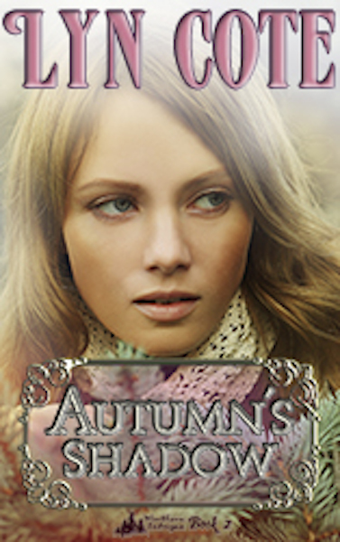
#1
#2
#3
#4
Here are four images I’m considering to replace the one on my present Autumn’s Shadow cover. This is a story with mystery and romance and my heroine struggles with a trying family while carrying great responsibility.
So which one do you think EVOKES the most reaction from you?
Which one touches your emotions? That’s what I’m looking for. A good cover grabs a reader’s attention and provokes a response.
I have my favorite but that might not be the best choice!
So please help me choose. Or should I just stay with the one I have already? Glance at the previous blog post and the featured image. Decisions-decisons!
If you leave a comment, your name will be entered into a drawing for a $5 amazon gift card so weigh in please!–Lyn
About Lyn Cote
Lyn Cote welcomes other authors to her "Strong Women, Brave Stories" blog to share stories of women who triumph over the challenges common to all women.
#4. I like the more modern look of this model in this photo.
I have read and enjoyed these books. I understand the new covers hopefully grabbing the attention of new readers, but I really liked the simple covers of the snowflake, leaf and daisy. BUT…I didn’t realize that there was a fourth book in this series. I think I need to go back and reread the first three and then read the fourth! 🙂 Always fun to find new books I didn’t know about from authors I so enjoy! 🙂
I loved the old covers too, Ronya. But when I republished them I couldn’t use the original ones. And yes there is a fourth book and there will be a fifth come fall, LOVING WINTER.
Although I liked the original cover it is a little soft looking for the type of book. I think I would prefer cover #2 as it looks a little more mysterious.
I LOVE # 4!!! Perhaps the current photo does look a bit dated…but I would definitely be more attracted to # 4 because her face isn’t at prominent on the cover. I am having problems with links not working on Amazon today and getting error codes when I try to check on kindle books.
I think #3 looks intriguing. It might be more connected to the title with something connected to Autumn in the background, say colorful foliage or a barn. Just a thought.
I do think the current cover looks a bit dated. My favorite of the new ones is #4. That’s the one that intrigues me the most. It also seems to be the best match for books 1 & 3 in the series.
Numbers 2 and 4 fit best with the other solo head-shots. Number 4 is close, but rather pensive. I like number 2 the best, but you would need to edit out the hand for it to be a best fit. Number 1 is nice, but the model has wonky eyes… one eye is looking at me and the other is looking up and to the right. Number 3 has the same feel as the current cover… dreamy and not intriguing. I care more about what she’s thinking than the current cover model, but she’s much too complacent for this to be a mystery. All that said, I guess my vote would be for #4.
I don’t think Autumn when I look at the current cover and clothes wise, a little dated. I like the number 4 cover, but it still does not about Autumn to me. Maybe a little of Fall colors added to cover would help. The cover is the first thing that captures my eye when choosing a new book. Hope this helps.
I think #2 suits her best. It makes her look like she is stuck in a glass cage. Because of the money her dad has and his attitude plus actions that allows him to get away with things she has to feel a little closed off. She has such a giving/caring personality but some people in the town have a hard time seeing her instead of her dad. I enjoyed the book. I thought it was well written.
I agree with a lot of the other readers. I think since the name of the book is Autumn’s Shadow, there should be fall colors on the cover. Also, I don’t like the closeup. I prefer book covers to have some background.
Now that I see that this is a principal in a high school number 3 makes the most sense. She looks the part where the original cover looks more like a high school student. The photo looks like it could be in a school hallway. (In my area a woman principal is generally in her late 30’s and up. Takes awhile to work up to that level.)
The “old” cover looks to me to be a bad CG drawing. Of the suggested “new” covers, I like #3. The women in photos #1 and #4 look like they have dirty or wet hair and #2 looks like she’s holding a wet veil off of her face. Why all the “water”? Spring means rain to me. Fall is bright color and cool crisp weather. The woman in #4, to me, looks likes she’s exhausted and fed up. Intriguing, but still not sure it conveys “Autumn’s Shadow”.
Hi Lyn, I think #1 fits better with the other covers of the series. The ‘old’ cover tends to make me think the cover is geared to tween readers and not adults. However, if I like an author I don’t usually look at the front cover and in some instances even the back ‘about’ cover as I have delayed reading some fantastic books by not going with what I know. Some authors are great and you just read them because they are great. You are one of those authors.
Hi Lyn, I actually like the original cover, but out of the new cover pictures I would choose #2 as my choice for a book that has a mystery in it. The other book cover pictures, the women look so sad. I wouldn’t want to read a sad book. I love reading stories about kids of any age though.
I guess I’d have to choose #4. However, all 5 of the covers seem to be to old looking for a book about teens. To me, these ladies seem to appear to be more in their twenties, and would make good covers for different stories. I’m in the senior citizen bracket and realize that kids these days try to look older but even comparing them to my nieces, nephews, and friend’s kids they still seem to be old.
# 2 catches my attention the most. It makes me want to know more about the girl. #4 is a close second for me. But something I don’t like as much about that one (as #2) is that there is no other background shown, just the girl’s face. I think that could be a great cover if there would be a bit of background, or something telling a little more of the story, showing behind her.
I personally like the original cover. It has some character and seems to convey the style and feeling of the book better. I wouldn’t change it! These covers on this page just don’t show anything to me, except maybe the one with snow some, but it’s still not my favorite. I guess readers are used to seeing more action or scenery on the cover, something more than just a face. Or it could just the timing of the book coming out….there are so many choices out there. Good luck!
#3 is the one that speaks to me. She is a woman struggling with life. The women on thecurrent cover and the other options seem, to me, to be relaxed, maybe curious about something, but not unhappy with their lives.
I clicked on the wrong link so saw the series of covers first and before I even read the description it reminded me of the 80’s and Jeanette Oke books (nothing against her, but may not be the vibe you’re looking for 😛
All of these are nice options, my personal preferences lean towards number 1 and then number 2. And I don’t think it has anything to do with it being set in a high school since the main characters are adults.
Primary Widget Area
This theme has been designed to be used with sidebars. This message will no
longer be displayed after you add at least one widget to the Primary Widget Area
using the Appearance->Widgets control panel.
#4. I like the more modern look of this model in this photo.
I have read and enjoyed these books. I understand the new covers hopefully grabbing the attention of new readers, but I really liked the simple covers of the snowflake, leaf and daisy. BUT…I didn’t realize that there was a fourth book in this series. I think I need to go back and reread the first three and then read the fourth! 🙂 Always fun to find new books I didn’t know about from authors I so enjoy! 🙂
I loved the old covers too, Ronya. But when I republished them I couldn’t use the original ones. And yes there is a fourth book and there will be a fifth come fall, LOVING WINTER.
I really like #4. Not sure why or what it evokes in me. There’s just something about it that I like more than the others.
Number 2 catches my attention the most. When I looked at the original cover it didn’t get my attention like the first book did.
Although I liked the original cover it is a little soft looking for the type of book. I think I would prefer cover #2 as it looks a little more mysterious.
I LOVE # 4!!! Perhaps the current photo does look a bit dated…but I would definitely be more attracted to # 4 because her face isn’t at prominent on the cover. I am having problems with links not working on Amazon today and getting error codes when I try to check on kindle books.
I like #3 and #4 best.
The original doesn’t draw my attention at all, and of the four books, it looks very dated and not mysterious at all.
I think #3 looks intriguing. It might be more connected to the title with something connected to Autumn in the background, say colorful foliage or a barn. Just a thought.
number 3 is my favorite.
I would vote for #4.
I Like #4 best
I do think the current cover looks a bit dated. My favorite of the new ones is #4. That’s the one that intrigues me the most. It also seems to be the best match for books 1 & 3 in the series.
I liked the old only.
I like 4.
I like number 2
I like the current one best.
#3 looks groomed for her job
Kathleen ~ Lane Hill House
2 or 4…
Lyn, I like the old cover best. But if you choose a new one, I suggest #4 because she looks like she has a lot on her mind and kind of afraid.
Numbers 2 and 4 fit best with the other solo head-shots. Number 4 is close, but rather pensive. I like number 2 the best, but you would need to edit out the hand for it to be a best fit. Number 1 is nice, but the model has wonky eyes… one eye is looking at me and the other is looking up and to the right. Number 3 has the same feel as the current cover… dreamy and not intriguing. I care more about what she’s thinking than the current cover model, but she’s much too complacent for this to be a mystery. All that said, I guess my vote would be for #4.
I like #2 best.
#4 is perfect for the concept.
I vote for photo #1 because it looks like it would belong with a mysterious story.
I don’t think Autumn when I look at the current cover and clothes wise, a little dated. I like the number 4 cover, but it still does not about Autumn to me. Maybe a little of Fall colors added to cover would help. The cover is the first thing that captures my eye when choosing a new book. Hope this helps.
I think #2 suits her best. It makes her look like she is stuck in a glass cage. Because of the money her dad has and his attitude plus actions that allows him to get away with things she has to feel a little closed off. She has such a giving/caring personality but some people in the town have a hard time seeing her instead of her dad. I enjoyed the book. I thought it was well written.
I like #4 as she looks pensive suggesting turmoil. The old cover was very 60ish so looks like an old book.
I like #2. It says mystery the most. I guess I like something other than just a face.
I agree with a lot of the other readers. I think since the name of the book is Autumn’s Shadow, there should be fall colors on the cover. Also, I don’t like the closeup. I prefer book covers to have some background.
I choose #2. It seems to convey the most emotion to me.
Now that I see that this is a principal in a high school number 3 makes the most sense. She looks the part where the original cover looks more like a high school student. The photo looks like it could be in a school hallway. (In my area a woman principal is generally in her late 30’s and up. Takes awhile to work up to that level.)
The “old” cover looks to me to be a bad CG drawing. Of the suggested “new” covers, I like #3. The women in photos #1 and #4 look like they have dirty or wet hair and #2 looks like she’s holding a wet veil off of her face. Why all the “water”? Spring means rain to me. Fall is bright color and cool crisp weather. The woman in #4, to me, looks likes she’s exhausted and fed up. Intriguing, but still not sure it conveys “Autumn’s Shadow”.
#1 evoked the most response. I wondered what had happened in her life and wanted to read the book to find out.
I like #4 the best. I seem to evoke mystery and intrigue.
I think #1 as it looks like she’s peeking out from her hiding spot, like she’s been in the shadow for a long time and wanting to ‘break out’.
wfnren at aol dot com
I would choose #4 because she looks so deep in thought. Making life decisions is very difficult and she looks to me to be struggling and perplexed.
Lyn, I think cover #2 suggests mystery and secrets. It is my favorite of all the choices.
I like # 4. To me it feels like she’s looking for something or someone but hiding at the same time. Huge fan of your work.
Hi Lyn, I think #1 fits better with the other covers of the series. The ‘old’ cover tends to make me think the cover is geared to tween readers and not adults. However, if I like an author I don’t usually look at the front cover and in some instances even the back ‘about’ cover as I have delayed reading some fantastic books by not going with what I know. Some authors are great and you just read them because they are great. You are one of those authors.
Hi Lyn, I actually like the original cover, but out of the new cover pictures I would choose #2 as my choice for a book that has a mystery in it. The other book cover pictures, the women look so sad. I wouldn’t want to read a sad book. I love reading stories about kids of any age though.
I like #3 the best. It seems to fit the idea of the high school principal better.
I like #4 the best. I like that the woman on the cover is not looking at me. It adds some mystery and suspense to it.
between 1 and 3 they are g reat pic and would be a eye catcher and then you had swag it would go quick
#4 and the present cover appeal to me; a book about teens, less so
I guess I’d have to choose #4. However, all 5 of the covers seem to be to old looking for a book about teens. To me, these ladies seem to appear to be more in their twenties, and would make good covers for different stories. I’m in the senior citizen bracket and realize that kids these days try to look older but even comparing them to my nieces, nephews, and friend’s kids they still seem to be old.
Hi Mary, The heroine is the principal of the high school. Sorry I didn’t make that clear.:-)
# 2 catches my attention the most. It makes me want to know more about the girl. #4 is a close second for me. But something I don’t like as much about that one (as #2) is that there is no other background shown, just the girl’s face. I think that could be a great cover if there would be a bit of background, or something telling a little more of the story, showing behind her.
I like covers #3 and #4.
I think #2 is the most evocative. Thank you for letting your readers be a part of the process!
I like #4. It’s powerful, yet haunting. I want to know more about this woman simply by looking at this image.
I think #4. I like that she doesn’t seem to be looking at me:)
I personally like the original cover. It has some character and seems to convey the style and feeling of the book better. I wouldn’t change it! These covers on this page just don’t show anything to me, except maybe the one with snow some, but it’s still not my favorite. I guess readers are used to seeing more action or scenery on the cover, something more than just a face. Or it could just the timing of the book coming out….there are so many choices out there. Good luck!
#3 is the one that speaks to me. She is a woman struggling with life. The women on thecurrent cover and the other options seem, to me, to be relaxed, maybe curious about something, but not unhappy with their lives.
I like the fourth one!
#4 is the cover I would use.
I clicked on the wrong link so saw the series of covers first and before I even read the description it reminded me of the 80’s and Jeanette Oke books (nothing against her, but may not be the vibe you’re looking for 😛
All of these are nice options, my personal preferences lean towards number 1 and then number 2. And I don’t think it has anything to do with it being set in a high school since the main characters are adults.