Comments

Need Your Guidance on Another Cover! — 51 Comments
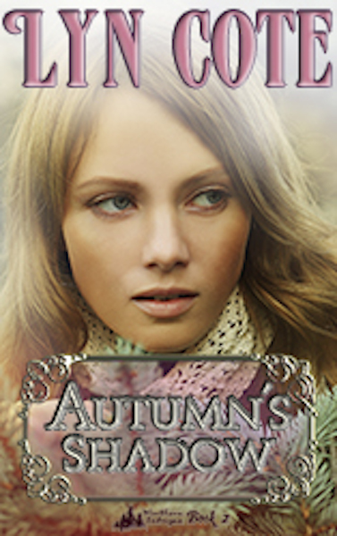
  1. What message do you want to get across? Mystery? Summer? Romance?
    To me it does not look mysterious at all. With the heavy scarf at her neck it does not connote summer either. But it does look like a romance. All romance novels feature a beautiful young woman or a bare chested man on the cover; what’s new there?

  2. Of the four covers, Mistletoe and Sage is my least favorite. Maybe because it is so different from the solo female head-shots of the other three. Or because that one actually does feel dated to me. Or maybe because the title doesn’t jibe with the seasonal titles of the others. Of the three remaining covers, the Autumn’s Shadow cover is the least dynamic. Summer and Winter are crisp and the models are looking away from the reader. I want to know what they are looking at; searching for. Autumn is soft and fuzzy and the model is facing the reader but her eyes are shifted to the left. Like she’s lying about something. (FWIW: Psycho-babble says looking away and to the left indicates the subject is lying.) There’s something just a half-a-bubble off about it. It’s a pretty cover, but not intriguing. Anyway, that’s my take on it. I hope that it helps.

  3. It’s not eye-catching to me. The colors are too muted. The cover model should look a little more suspenseful, frightened or on edge?

  4. Well, now that I saw a whole group of choices, #2 is the most intriguing with the girl looking through the window and rain making her appear wistful as she peers out the glass at the world beyond.

  5. the only thing that looks like the time of year, Autumn, is the sprig of evergreen in the lower right corner and the knit infinity scarf around the model’s neck. It really doesn’t offer much to go on.
    I like the cover for Winter’s Secret #1 because I want to check out what the model on the cover is looking at off in the distance, so already it’s mysterious and draws me in.

  6. The cover does seem to go ok with the others, but I would not think it was a mystery.

  7. I agree with many of the comments here and would add that the sideways glance adds to the slightly off feel for me and that, when viewed with the other covers, it definitely stand out that she is the only one not in profile.

  8. P.S.
    Having read the other comments, I only agree with the colors problems… It doesn’t say mystery because of the full face vs the profile or 3/4 view.

  9. Personally I think the cover is OK. It matches the first and I like the soft focus. I really don’t think it’s the cover. Maybe the synopsis?

  10. The title says “Autumn” but the colors say “Spring”. I can’t really say about the dated part. Maybe the girl should be back a bit with some shadow across her face.

  11. I’m not drawn to the cover. The picture is very prominent, but doesn’t give any insight into the setting. The title is almost lost in the colors of the bottom of the picture. I think the picture of the lady needs to be further away and show part of the books setting in the background.

  12. I wonder if the girl was more in a shadowy setting then it would convey the title more. She is so in your face and unlike the others no mysterious look about her.

  13. I always look at a book’s cover. I think this one is dated, for sure. There is too much “girl” and nothing else to let you know what the book might be about. The colors didn’t attract me either. A little nature in the background goes a long ways, as well.

  14. The girl on the cover doesn’t portray the title of the book. She needs to be in the background with an autumn scene – trees with leaves falling, somehow in a shadow, not in the foreground. It could be at a boat dock, with frosty ground. Put some more details into the cover – not just the girl.

  15. When I read a book, I like to form my own picture of what the H/H look like. The other three at least have some mystery of what the heroine looks like, but the one in question is a full face with nothing left to the imagination. I hope that makes sense. Also, I didn’t check for release dates, but I find that sometimes when books in a series are released close together, I’ve skipped one. That is my excuse and I am sticking to it, because it certainly can’t be because I’m old and forgetful. LOL

  16. I agree with the comments about the girl being too close and not much of the background showing. It does appear dated and nothing tells me this is a mystery/intrigue, but makes me think it might be a romance.

  17. I think the cover is a bit 70s I’d change it completely I think a cover sells a book if the cover is not attractive I won’t buy it and if the cover doesn’t match the character description that drives me crazy. Maybe a autumn background where you see the leaves and the changing colors and someone walking through the leaves and daydreaming or deep in thought

  18. Hi,

    This looks a lot like an eighties cover and I cannot get any clue as to where it is set or what might be involved in the tale. Some readers would be looking for a Western tale and others a Manhattan tale maybe; this doesn’t indicate if it is a romance, suspense, family saga, historical or other. I would suggest keeping the soft brown and amber colour theme for Autumn but showing more of the location and giving a hint of story or theme.

  19. I think the problem is that the girl is too close; she, or maybe the whole cover, is grainy. That is unlike the other covers, which are very sharp.

    CutePolarBear

  20. I do agree with you. Maybe it is a bit 80’s. And let me tell you that pink is my favorite color. I love it, but it may not say “mystery”. I think pink says more romance. But that may be just me. I hope this helps you a bit. ๐Ÿ™‚

  21. Definitely looks like an older romance, not mystery. She is the only girl facing the camera and the pink hue looks too sweet. Maybe not so close up on a girl either. Since it is autumn maybe show some fall leaves around her.

  22. Picture of girl from the side would give it a mystery feeling. Straight on pic needs to go.

  23. The cover is just too bland. It needs something to “jazz” it up and catch the readers eye.

  24. I think the cover needs updating. There is not much to see other than the woman’s face where as in the other covers you see more background that seems to fit the settings.

  25. I think the cover seems too outdated and from the 80’s. The woman on the front doesn’t seem to fit with the other models on the covers in the series. The cover is also too plain. It needs something to catch the reader’s attention and to show that it is a mystery book.
    I also think your name should be in white font like the other books are.

  26. Where as I don’t typically “judge a book by it’s cover”, there is something about this one that seems a bit off. Maybe it’s because I am not a fan of the cover being completely taken up by a person. Seems like a smaller picture and more background might work, I’m not sure. I do think the book sounds good though!

  27. I have to agree, this cover doesn’t really seem to fit, either with the title, or your others in the series. I think it does look more like an 80s picture.
    I like books that compel me to read them, but this one doesn’t have that.
    I like the way your others have more of a side view of the character. That lends to the mysterious feel. And the coloring should be more in line with autumn colors.
    Good luck on a new design! ๐Ÿ™‚

  28. I looked at the other covers. They each represent the season. I see no signs of autumn in this cover. Maybe an autumn scene with pretty fall leaves and the girl dressed in a dark green sweater for fall but not being so prominent. Thanks for letting me express my opinion.

  29. I am not a fan of this cover. It does seem rather dated in comparison to the other books in the series. Mysteries need a dark element on the cover be it shadowing, filter, or the type and font colors.

  30. Yes, I think it looks a little out dated. I think the old cover was better.

  31. Pull out on the close up of the girl on the cover. Put something behind her that clearly doesn’t say “80s”.

  32. I don’t think it is outdated. It just looks too light and summery. It’s more close-up than the others and the light coming down from the top doesn’t help the “mystery-feel” of the book. The current cover may be nice for a different genre, just not for this particular series.

  33. I typically am not drawn to book covers featuring people. I prefer to imagine the character’s appearance based on the author’s description and my own imagination. With this particular cover I wonder if the title seems to be at odds with the colors. Autumn speaks of bold reds, oranges, and browns; the pastel tones on this cover make me think of spring.

  34. I agree with you it looks outdated but the title also fades away. Your name is more prominent then the Title. There is no real suspense or mystery alluded to in the cover to attract that type of a reader. No shadows or edge in the cover. How to fix it, make it not just fade around the edges but show some darker fading toward the right edge. Change the boxes out title to just a stronger title with out the box. could be done with a change in font and color.

  35. I think for a mystery the cover looks soft, more like a romance. I also think the colors for autumn need to be more vibrant. I don’t believe autumn colors include pale pinks. And you need some edginess or starkness to give it a look of suspense.

  36. I think also the colour of your name is wrong. The pink is too soft for a mystery. I think if you could use the white like the other ones. I don’t mind the face but its softer than the others. I like the first one where its more side on.

  37. this cover is a little to soft for a intrigue book. looks more like a romance cover.

  38. The girl looks like she is scared definitely needs some else on the cover

  39. I wouldn’t buy it. It does not catch my eye. I believe that the cover needs to attract either by the pic or even the colors. Something ng that makes it stand out. I hope it helps.

  40. I wouldn’t buy it. It does not catch my eye. I believe that the cover needs to attract either by the pic or even the colors. Something ng that makes it stand out. I hope it helps.

  41. The current cover kind of reminds me of an 80’s romance novel. And it really doesn’t tie into the other covers in the series. It feels soft and gentle, it’s missing the element that says “mystery.” The other commenters have some really great suggestions that might help catch more attention. I don’t know how much control you have over the covers but one suggestion might be to tie all of them in with each other using a similar element or theme, I’m thinking ideas like Regina Jennings’s Ozark Mountain Romance series never fully showing the heroine’s face or Alana Terry’s split/dual image covers on her Kennedy Stern series. Just a couple of thoughts for whatever they are worth….

    Many blessings to you and your writing!
    Jasmine

  42. I don’t like this cover for that book title. It doesn’t have anything “Autumny” in it. It needs some fall colored trees in the background.

  43. My first thought when I saw it was that it had an 80’s feel to it. I would give her a more modern look.

  44. She’s a lovely girl, but I would not have guessed the book was a mystery romance by looking at it. It looks more like a historical romance. Perhaps if she was peering through leaves and looked more interested in whatever is off in the distance…

  45. Although most of the covers don’t give much insight into the books, the other covers do offer a bit more of a background to sort of go with the title. This one isn’t necessarily dated but it seems a bit plain is the best way to put it. Maybe a cover with a little more detail instead of just a head shot. I know when I browse to buy books if cover doesn’t catch my eye I won’t even look at the excerpt about the book. I hope this helps.

  46. L. thanks for the comment. I’m impressed that you uncovered the very first cover I used. Come back and see the choices tomorrow and perhaps win an amazon gift card!

  47. Personally, I think the girl on the cover is off-putting. I like the old cover that is dark with steps going down to a small pier on the water. It gives a sense of mystery & intrigue. I would definitely get rid of the girl on the cover.

Leave a Reply

Your email address will not be published. Required fields are marked *

This site uses Akismet to reduce spam. Learn how your comment data is processed.

HTML tags allowed in your comment: <a href="" title=""> <abbr title=""> <acronym title=""> <b> <blockquote cite=""> <cite> <code> <del datetime=""> <em> <i> <q cite=""> <s> <strike> <strong>