Lyn Asks for Feedback on Another Cover Model!
Can you believe it–I’m asking for help in choosing another cover model. At least nobody can say I’ve just spent the winter sitting by the fire sipping hot cocoa! Though I did do some of that. I already announced that my next book will be out in June and that it’s another “season” in my Northern Intrigue series. My new heroine is named Thea and she’s a shy sweet young woman who is surprised by her new neighbor (he’s handsome and a great guy of course!) and all the controversy he brings with his new ideas for Steadfast, WI. Hmmm. Could be interesting.
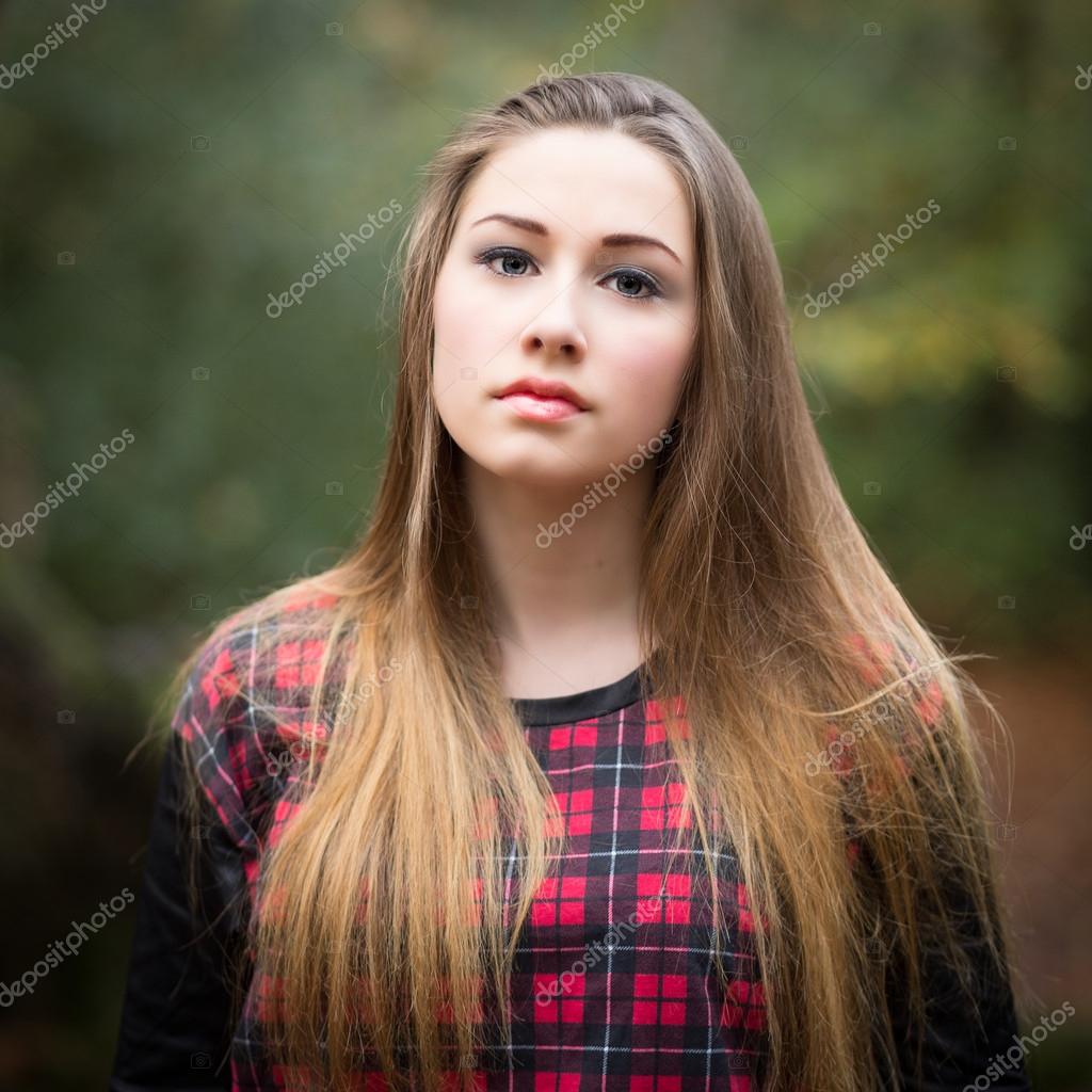
Hope it is. Here are the choices for the cover model. Yes, I know they are all the same young woman but I want to know which expression you think is most “engaging, evocative.” Which one would make a person-reader take a second look and perhaps click BUY?
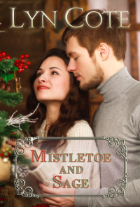
Here are the other books in the series so you can see what this “expression” needs to fit in with–especially the first 3. The final 2 are holiday novellas and have a slightly different look.
[foogallery id=”8467″]
And here is the model and her expressions.
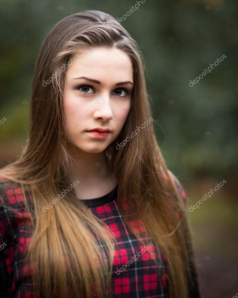 CHOICE #1
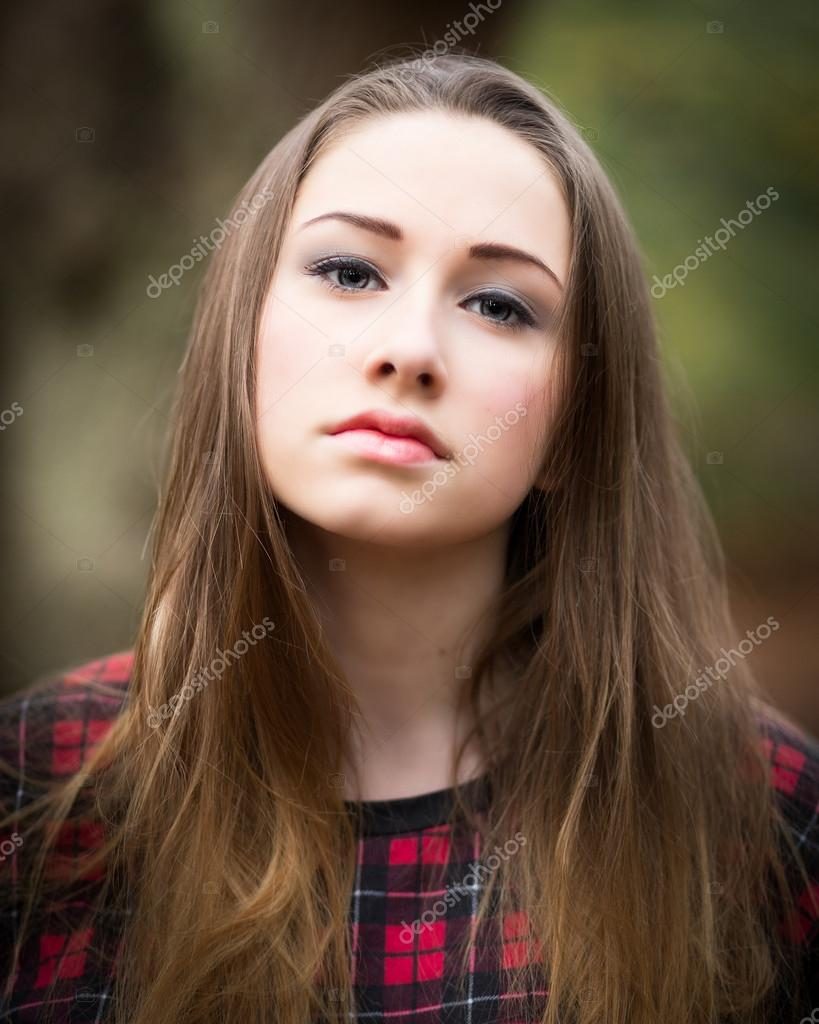 CHOICE #2
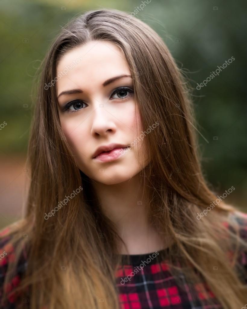
CHOICE #3
CHOICE #4
So which do you think will fit best with the series and get the best response? And if you don’t like any of them and think I should search again for a model, you can say that too! As usual, I will hold a drawing and one of the commenters will receive a $10 amazon gift certificate! So comment please–Lyn
