Comments

Decisions, Decisions–Help Me Choose a Book Cover-Please? — 45 Comments

  1. Pingback:Decision Made-Here’s the Cover-& Merry Christmas 1990! | booksbylyncote.com

  2. In search of seeking for a short time for any good quality view involving this one point . Researching in Search engines I eventually have discovered this page. Reading this So i’m thrilled to say that I have a really good sense I discovered just what I was looking for. For certain i will make sure to don’t forget this web-site and check it out constantly.
    Wedding photography

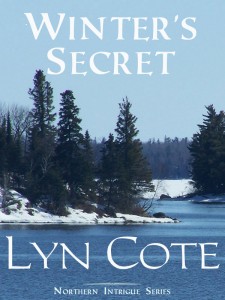
  3. I prefer the original one at the top.

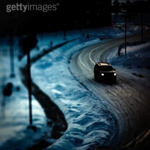
    “#1” doesn’t seem to stand out to me, other than if they are going to have a close call going around that curve meeting another car since they are in the middle of the road. Snowmobile tracks along the side of the road could show up if there was packed down snow instead of bare on the left.
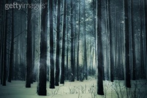
    “#2” seems believable. Again, I would put a snowmobile track amid the trees. More traffic, less suspicion, unless the tracks can be followed to one set being set off by a crooked link that would make a different mark.
    lanehillhouse[at]centurylink[dot]net

  4. Hi there- I think the image w/the car shows mystery. I like the forest image as well, but it seems to connote (is that a word?) supernatural to me. Good luck choosing a cover!

  5. I like the second choice best. The trees are scary and lend toward a sense of mystery, however there’s no indication that it’s a romance by this cover.
    I didn’t care for the car on the road because it looked fake–like a toy car in a made up scene. The tree scene is more realistic and grabbed my attention.
    It’d be nice if you could use the trees but maybe add a picture of the heroine and or hero into it. Just my two cents:)

  6. What fun, Lyn. You’re getting some great comments and it was neat reading the reasons everyone voted for this or that one. Made me go back and forth with my pick. The trees jumped out at me first, but both seem to be appealing and as some of the readers said, the first one’s not bad either.

    Thanks for letting us have some fun with this and good luck choosing the best cover for your e-book.

  7. I like them all,but think #1 is my favorite. Is someone/something following them? Where are they going and why? What will happen on this long,lonesome road,wintryI wonder?Good luck..

  8. Hi Lyn, looks like another winner on this book, as for the cover, I like #2 with all the trees. It makes me wonder is someone lost? It just looks like a mystery all surrounded in a mist.
    Paula O

  9. I like number two best. I don’t think it will be a problem with your title not showing up because you can use a light color instead of a dark one to make it contrast. Play with what makes it work best. You can even use an unexpected color like teal blue (which is kind of wintry but would still leap off the page) or go with caution tape yellow … or red… or mix them and do an orange … I mean I just read a book that had a very light beige top and a red bottom half (the lady was wearing a ball gown that color). The title and author’s name were done in light colors against her skirt so they would stand out. It worked beautifully.

    I think you could use the same thing and still get your air of mystery. The top one looks like any snowy, Christmas scene. The last one makes it look almost like something … paranormal is happening in the woods. I’d stick with number two. I wish you all the best though – I know whatever you choose will turn out great.

  10. Although they are both excellent I would choose #1 because you wonder where the suv is going and why.

  11. Number two has me instantly intrigued and wanting to know what this winter secret is! Captures my attention immediately! I am all for a good book cover- I truly judge a book by the cover! Good luck! 🙂

  12. #1 because it’ll show up better as an ebook cover. The woods in #2 might just interfere with the wording once the words are added.

  13. i would have been surprised that cover #2 hid a suspense story – unless i just can’t see that snowmobile (skidoo) hiding in the trees? i would pick #1 for that reason, but still think adding a skidoo into the pic would add to it. Thanks Lynn for trusting us to answer

  14. If I had to pick just one I would pick #2 because the woods and mist just make me think “mystery”. But, would it be possible to have both combined. Try dark woods with a narrow winding road, dark SUV on the road and lots of mist. Now that sounds great.

  15. I choose the winter woods number 2. The trees exude a sense of mystery and the clouds/mist seems to have faces in them. In other words my imagination sees things in the woods, and it’s very mysterious.

  16. I like the #2. The misty drifting out of the trees gives an air of mystery. “What is could be sneaking up on me out from the trees?”

    Merry Christmas and Happy New Years

  17. I’d go with the one you chose with your daughter! Don’t second guess yourself, it’s lovely.

  18. Thanks for asking our opinions. While I think both covers have a mysterious appeal, I don’t think I would pick #2 up to read the back of the cover. #1 is my preference – first of all, it causes me to feel the cold down to my bones….and I wonder who is in the car and why they are on that dangerous dark slick road at that time of the night. They seem lost and don’t know where they are.

    Merry Christmas Blessings to All!

  19. I like the SUV one, because it implies people with some kind of goal, good or bad. It’s also easier for design purposes. Trees are really hard to put lettering over because of all the verticals.

  20. #1 just doesn’t look like it fits on the cover of a book as suspenseful or mysterious. To be honest I wouldn’t even pick it up if it sat on a book shelf. It would never perk my interest!

  21. I personally like #2. With the woodsy scenery it just reminds me more of a perfect cover! It looks quite suspenseful!

  22. To be honest I like the cover you have right at the top. the other two picks makes me think it will be suspense (not a light suspense like LIS). but thats me I am not into heavy suspense. if I have to pick I would go for two.

  23. I like both pictures, but for the book cover the SUV speaks more to me of mystery. I actually like the bookcover you had in the first place. Between the two choices though, the SUV photo makes me wonder if someone is going to jump out and make the SUV stop, will they be robbed, what is going to happen on this dark dark road late at night.

  24. My idea is more about promoting your book. When the cover is too dark, it doesn’t show up as well on blogs and other web sites, so I would go with the tree one, just because it would show up better.

    I have sidebar cover ads from other authors on my blog. The ones with the really dark covers don’t catch my readers’ eyes as well as the ones with more contrast on them.

  25. I vote for No.2, but it’s win-win. The picture with the car is definitely intriguing. It makes me asks who’s driving and where are they going? No. 2 is both subtle and evocative. It drew me in immediately.

  26. I think the one with the trees is too murky and indistinct, and that it won’t show up well on Amazon. I also don’t think it would have a high quality, professional look. The winding road is much better. I do like the first one, at the top of the blog. I wonder if it could be darkened, and then a different, suspense-laden, ragged font could be used….perhaps even in blood red if the photo exposure was deepened for a more mysterious air.

    Roxanne,
    (with all sorts of opinions today!

  27. I prefer the one with the SUV on the dark, winding road. I know Liz said it spoke to her of heading home. I’m thinking she may be right – however, since I know this is a suspense novel, this cover leads me to suspect something is going to happen along the way.

  28. Number 2, combined with the title, spells mystery to me, while number 1 evokes “heading home” more than suspense.

  29. Definitely the one with the SUV. It would cause me to pick the book up to see what is going on. It really exudes mystery.

  30. This is tough! Not sure. Is there romance involved? I always like the half-profile pic of a woman at night too, or something. But all of those are interesting and pretty. I do like the two darker ones better for a mystery. Have fun!

  31. I choose #2. The story says snowmobile. SUV doesn’t seem to fit and it’s so dark, I don’t see me picking from a shelf. You have to admit, sometimes a good cover is what gets you, when choosing between two books. I pick the woods!

  32. Number 2. Because woods just adds to the mystery. Just imagining what’s lurking beyond the trees already has me spooked and it being dark, the moon is shinning and some mist to lure the reader in.
    jennydtipton@gmail.com

  33. The moment I saw the cover with the car on the winding road I was intrigued! It makes me think of a dark, cold winter evening in MN. Someone is on the run, escaping or hiding from someone. I immediately wanted to know who was in the SUV & where they were going!

Leave a Reply

Your email address will not be published. Required fields are marked *

This site uses Akismet to reduce spam. Learn how your comment data is processed.

HTML tags allowed in your comment: <a href="" title=""> <abbr title=""> <acronym title=""> <b> <blockquote cite=""> <cite> <code> <del datetime=""> <em> <i> <q cite=""> <s> <strike> <strong>